Visualization tools for network analysis
In my recent project, there is a need to create some visualization for the relationship between bank accounts. One bank account could serve as an intermediate account to receive money from its child account, and transfer the surplus to its head account. I want to find out the relationship between accounts and do some further analysis, so I searched online to find some visualization tools for network analysis, and here are some tools I try. TL;DR, Onodo is the most convenient and illustrative for network visualization, but it has some drawbacks that leave it away from doing further in data analysis.
Tableau
Since my primary analysis is on Tableau, it is a natural choice to give it a try. However, Tableau doesn’t officially support network analysis. There are some tutorials online using scatterplot and add a link between nodes, but in my case, the account numbers are categorical although in the integer format. If I use those numbers as continuous variables to plot it, there will be some huge gaps between those accounts, making the graph very sparse and ugly. It doesn’t support treating those numbers as categorical values, which is odd. In summary, Tableau is out of my consideration.
Onodo
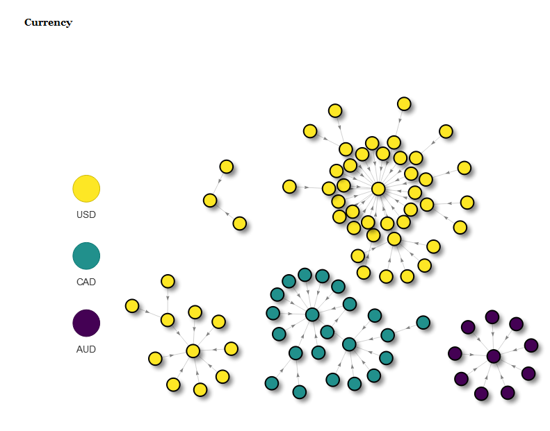
After doing some researches online, I found out this website Onodo that could allow you to start from scratch or upload an Excel file containing nodes and edges information and create an interactive graph without any code. I used R to modify the original dataset and output into an Excel file. The output turns out to be pretty cool! You could drag the nodes to play with it, label each node and color them by the categories. Here is what I got:
You could see the color palette is pretty neat, and the number of links automatically resizes the node size. You could also add different colors for different types of nodes. However, it is an online tool, which means that you can hardly integrate it into your current workflow, as it needs some extra work to generate output Excel file and upload it to the website. Moreover, there is no filtering, customized node size, link thickness, etc., which limit its use to just qualitative analysis. As a data scientist, I am not afraid of coding at all, so why not explore more options?
R
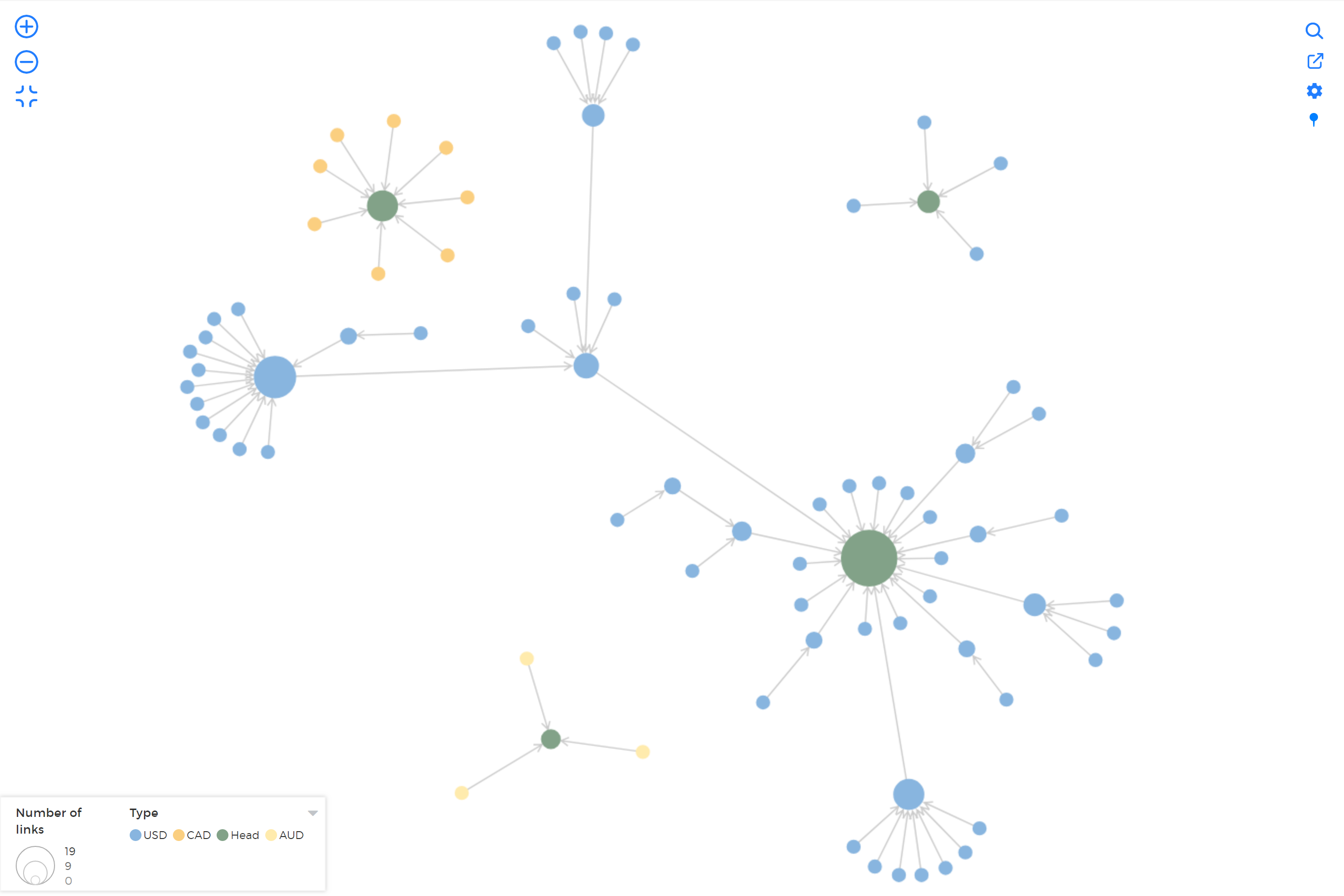
I frequently use R to do data wrangling and preprocessing, so another choice I am considering is R. R is very powerful, and there are lots of packages that could fulfill your need. I read this great article by Katherine Ognyanova and used it as the primary reference material. I mainly used a package called visNetwork, an R package using vis.js javascript library to create interactive network graph. After using for a while, I found that although the layout and motion are not as good as Onodo, you could customize almost everything in the graph. You could check the detail out at here, and this is a graph I generated using this package.
There are some drawbacks, though. First, the legend of this graph is a separate graph on either left or right, and the title position is bizarre: it always shows up on the very top of the page far from the figure, and I don’t find a way to adjust the location yet. Also, you need to use your own aesthetic and the different palette to name its color, which sometimes could be quite tricky. The reason I want to choose it over Onodo is that you have lots of options to adjust to meet your needs. I will give some codes and notes on how to customize different options and what questions I met during the process, so keep in touch!
